In partnership with Refuge Coffee Co. and GWCCA, our SCAD Pro team designed a welcoming micro-kiosk that merges community, movement, and meaning, serving as a vibrant first-touchpoint for guests from every walk of life.
"THE WHOLE IS GREATER THAN THE SUM OF ITS PARTS"
Create an inviting micro-kiosk first-touchpoint at GWCCA; supporting diverse visitors and reflecting
both brands.
Outcome
By uniting the Georgia World Convention Center Authority and Refuge Coffee Co., the kiosk becomes a point of convergence where two identities strengthen one another. Conceived as a welcoming threshold, the design supports the surrounding neighborhood while inviting people from different cultures to gather, connect, and collectively shape a vibrant sense of place.
Design in Application
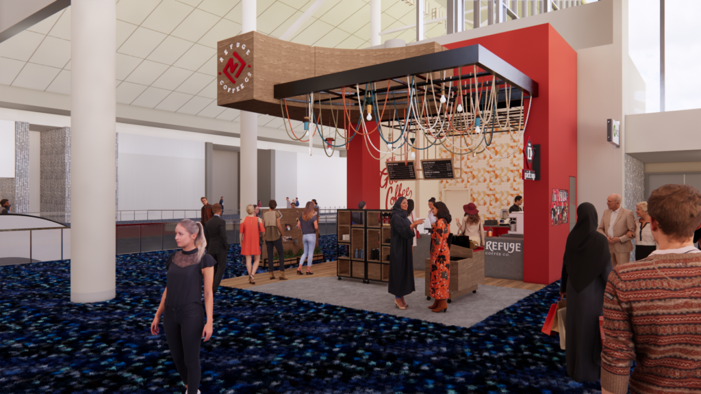
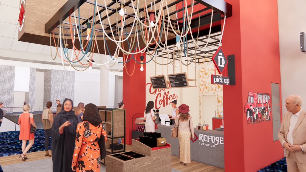
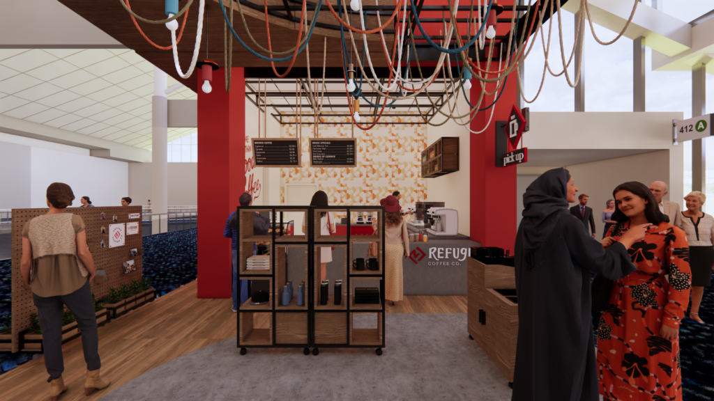
Rendered walkthrough
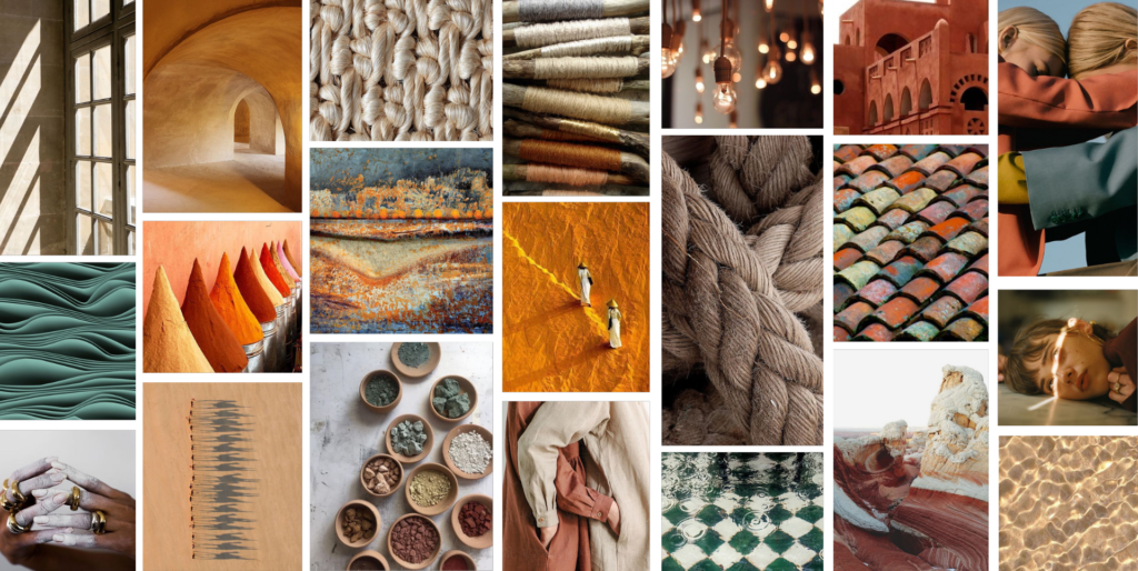
Mood Board |
GWWCA & Refuge Coffee Co.
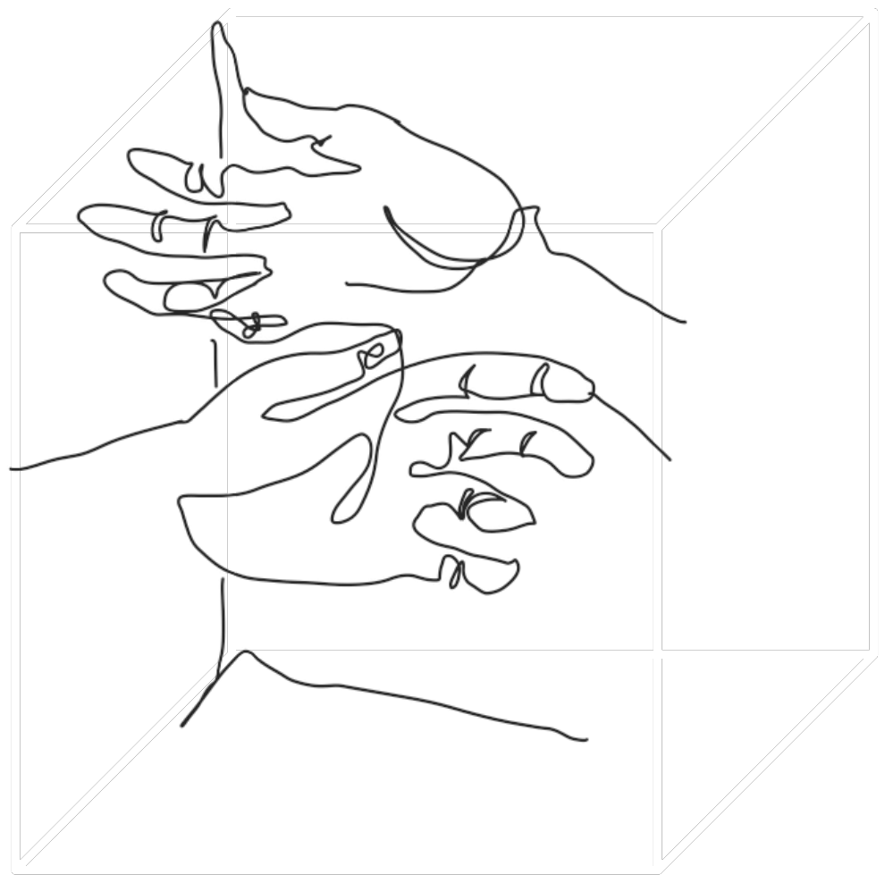
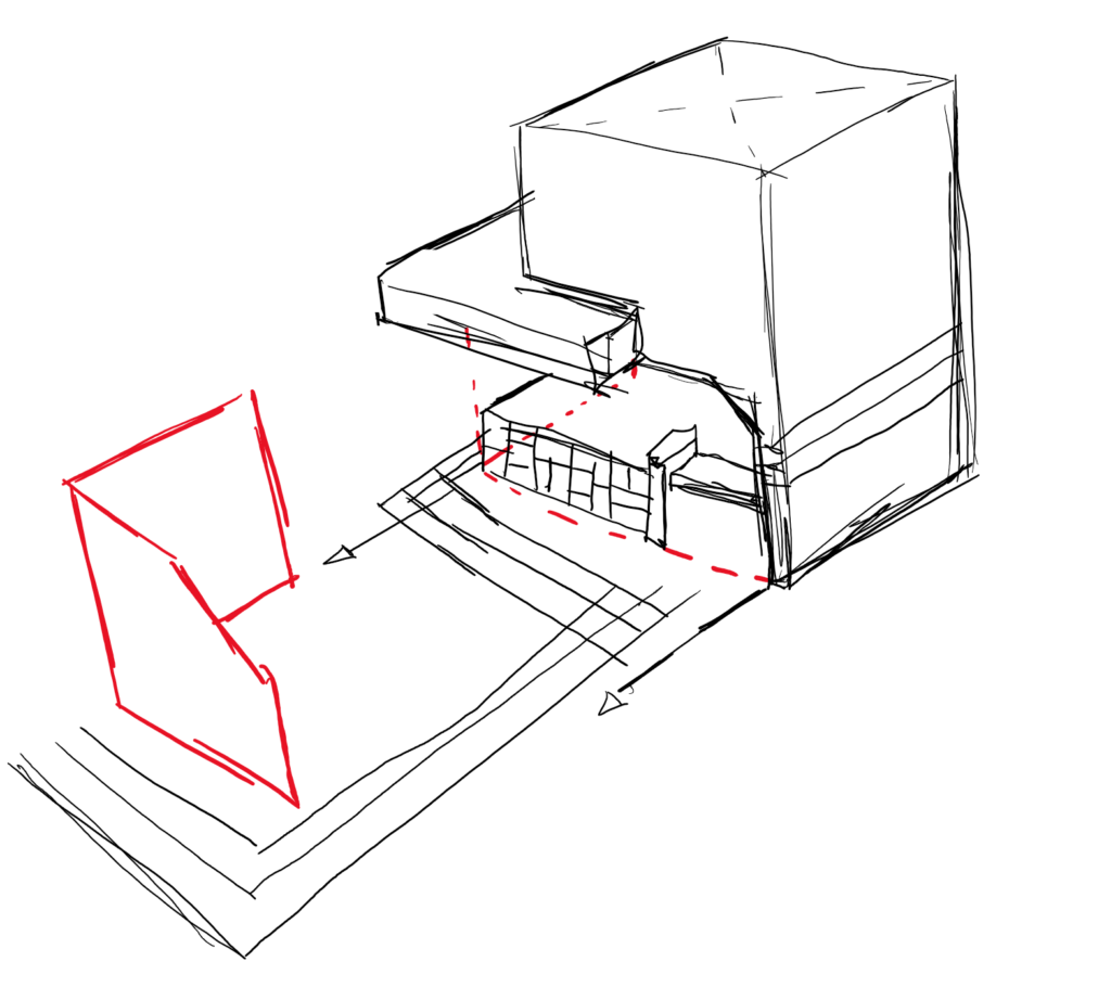
Parti Diagrams
Going outside the box, a cube is created from converging point. Within those points lines and volumes can be from and become intertwined. In this parti diagram, a simple cube is transformed into a “larger whole of parts.”
Users
Business travelers| Travelers| Locals | Staff
Studio: Word Mapping
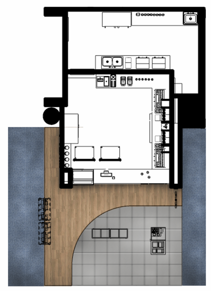
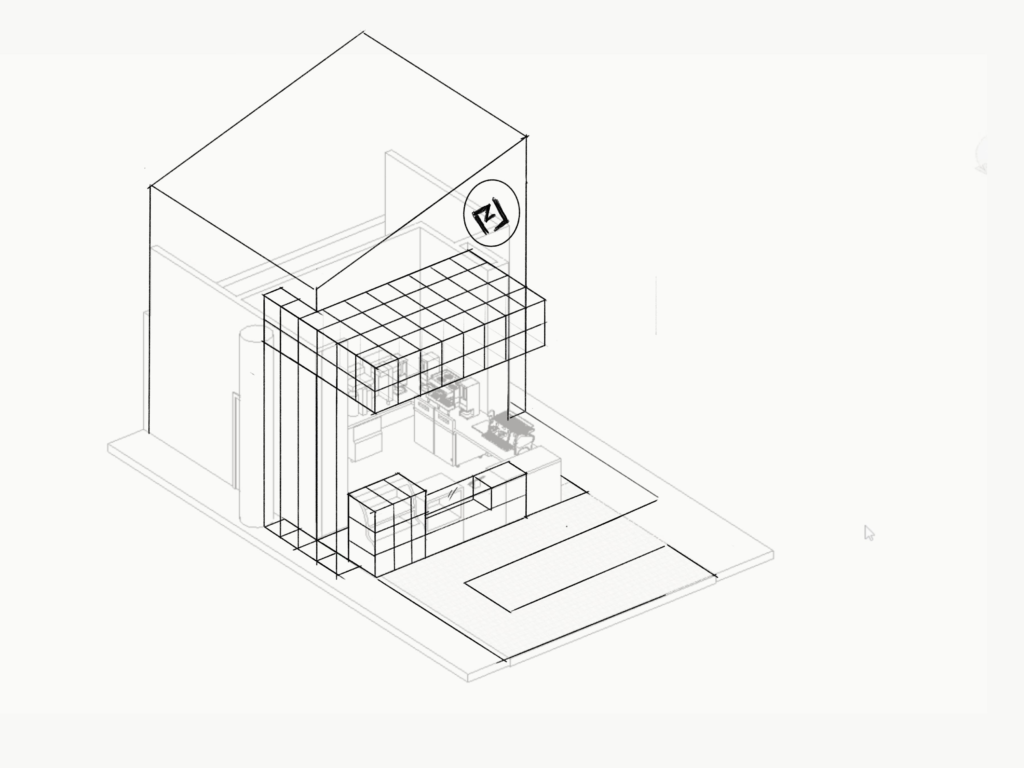
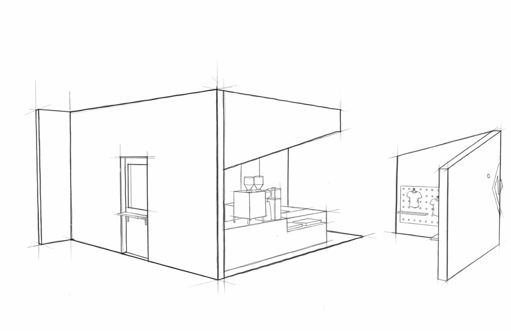
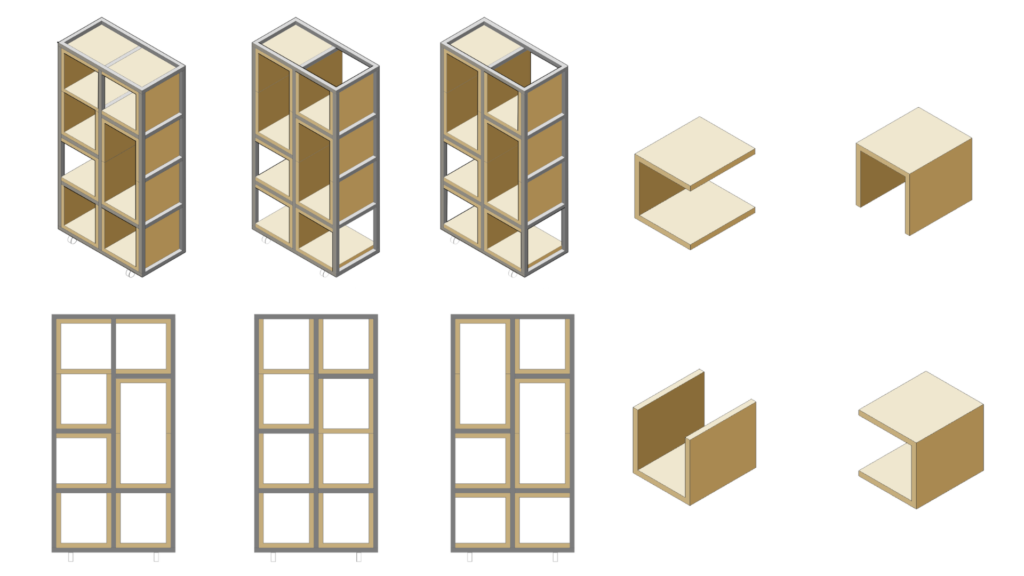
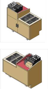
Ground floor & Basement Furniture Plans
Exploration
Studio IV | Group Diagrams and sketches
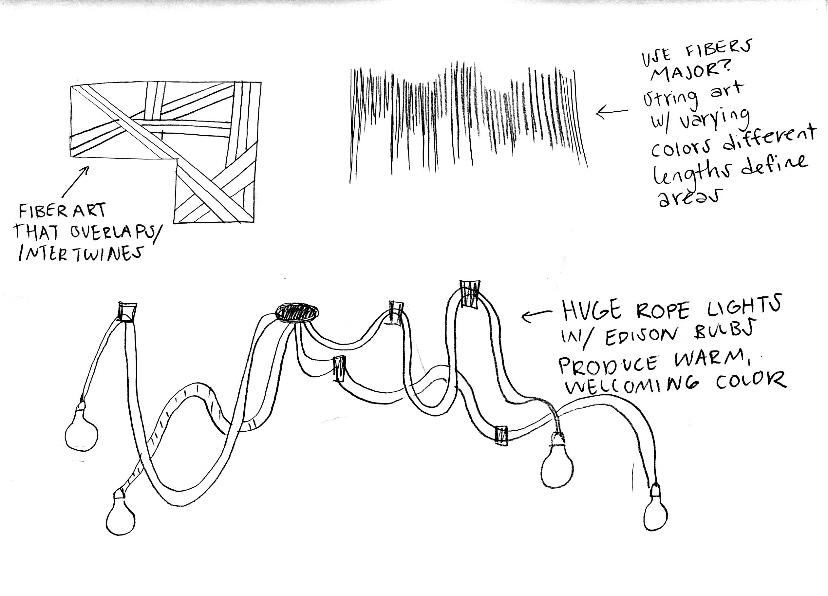
Intertwined concept development, the ceiling representing network.
The overlapping and layering would reflect Savannah’s streets, casting shadows in the main areas. The connections between the exterior, the ceiling, and the gathering within a space are depicted in the sketches.
Our Approach
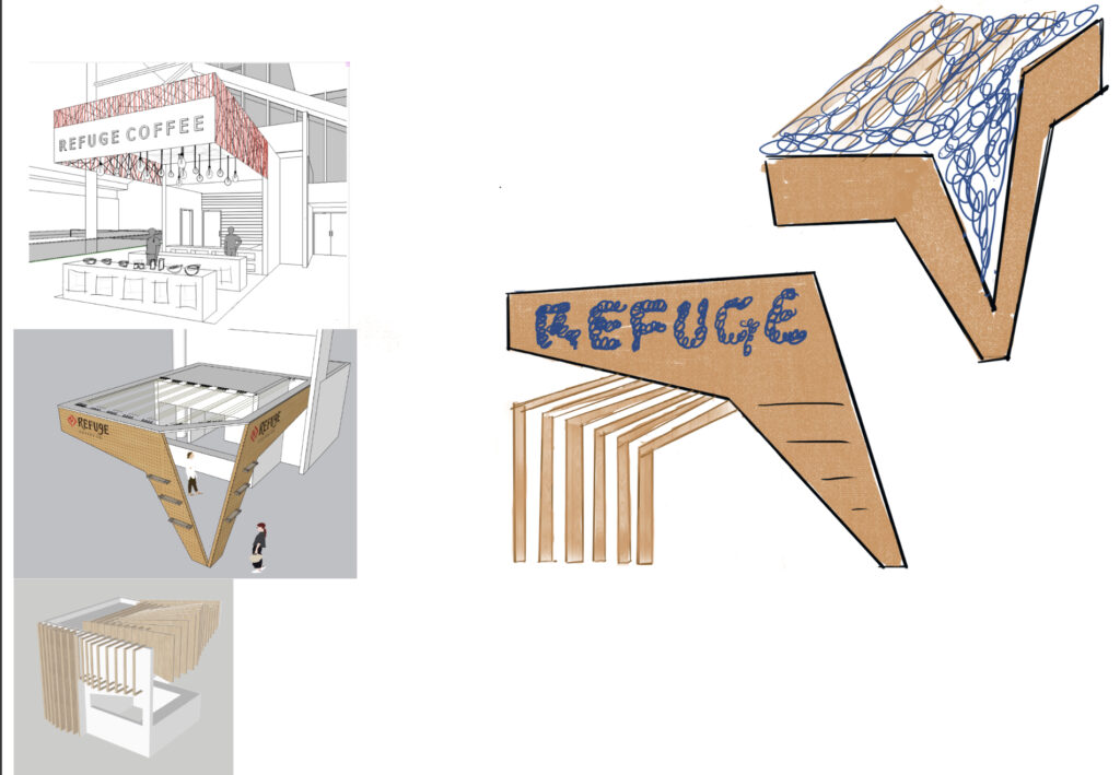
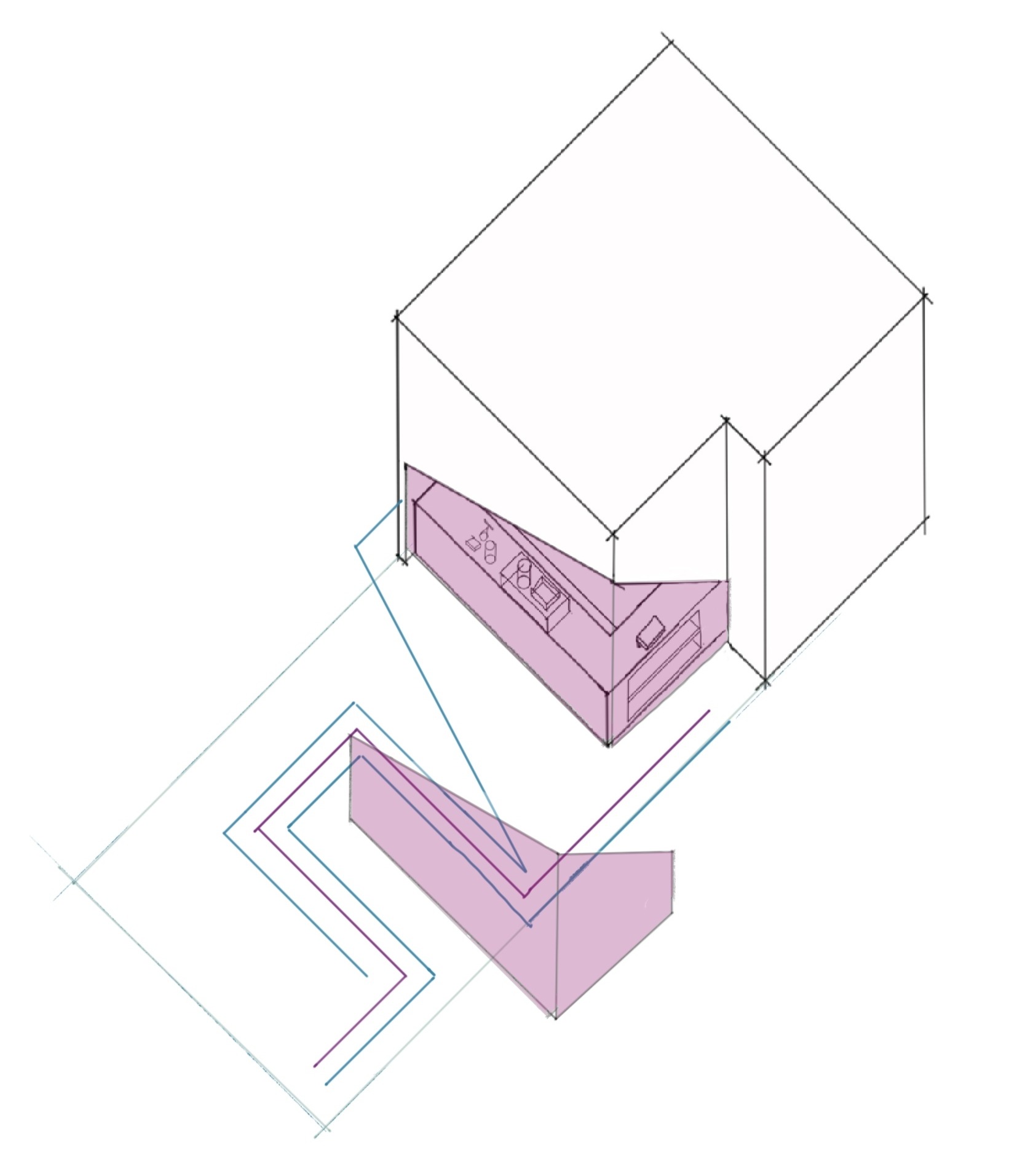
Façade Development
Enticing facade with various levels and depth and emphasis onthe floor pattern for queuing and display placement.
Moveable wall that define the corner of the GWCCA to direct visitors towards coffee , but add a physical block to the environment.
Combination of Corner and Intertwined, providing movability, security and exact queuing process. The space is opened up but still had an element that blocks the area.
Final look into how the flooring, volumes and negative/positive voids could be utilized The floor reflects the ceiling cantilever to provide spacing for a visual queuing process.
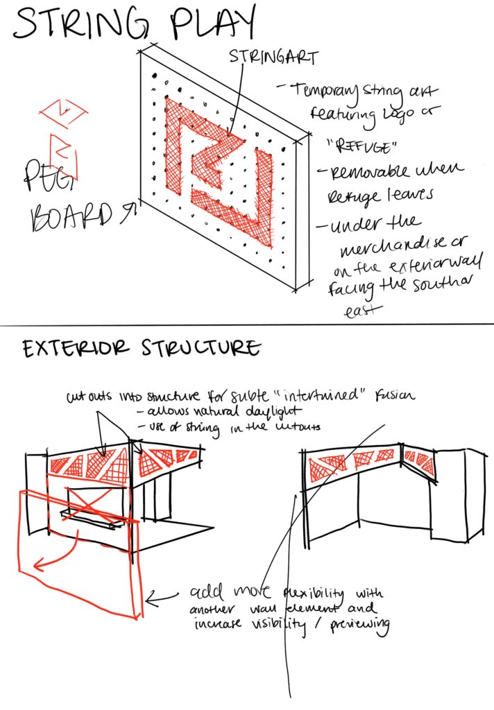
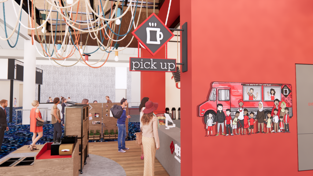
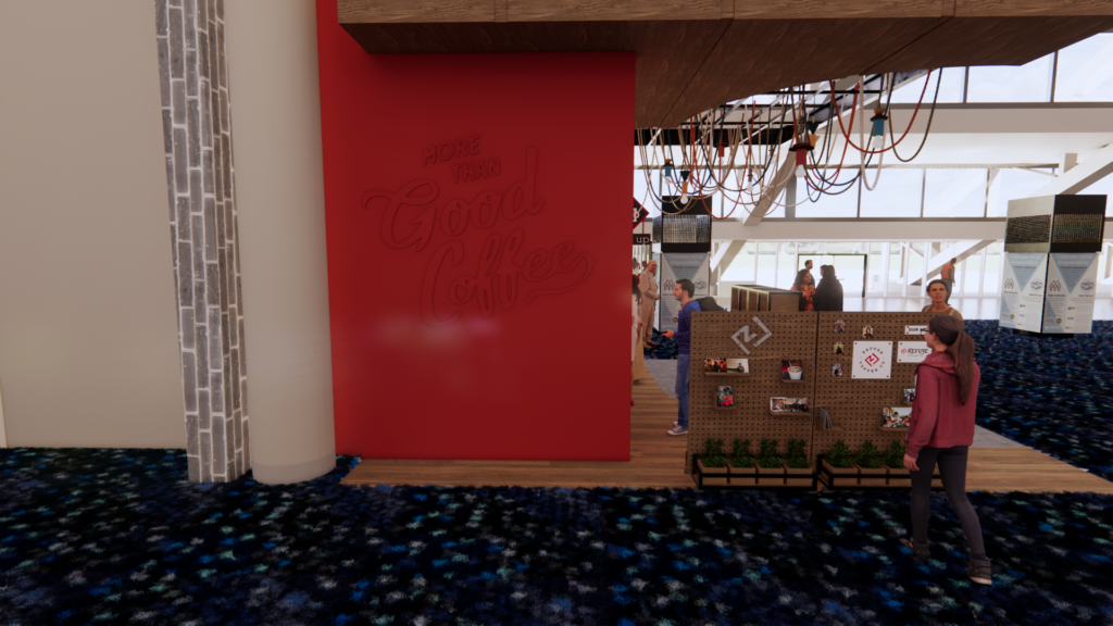
Ceiling string details in the ceiling to represent how society and stories interact, and a dedicated space for signage.
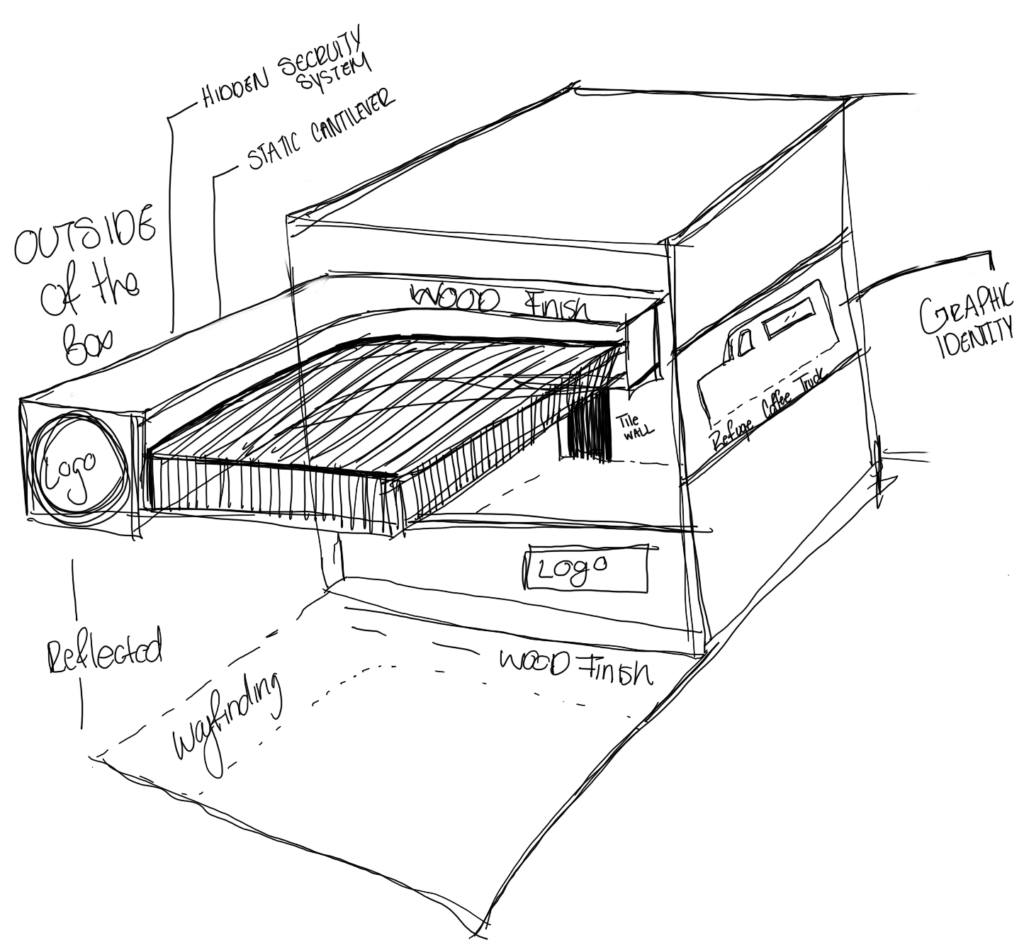
Identity
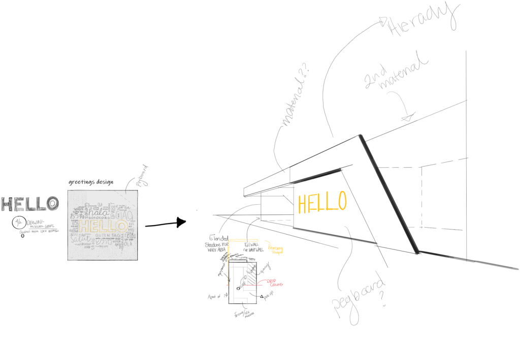
Exterior Signage
Bringing everything together greater than it is alone, from all sides of the structure there is a graphic identity the aids the narrative within the context of GWCCA
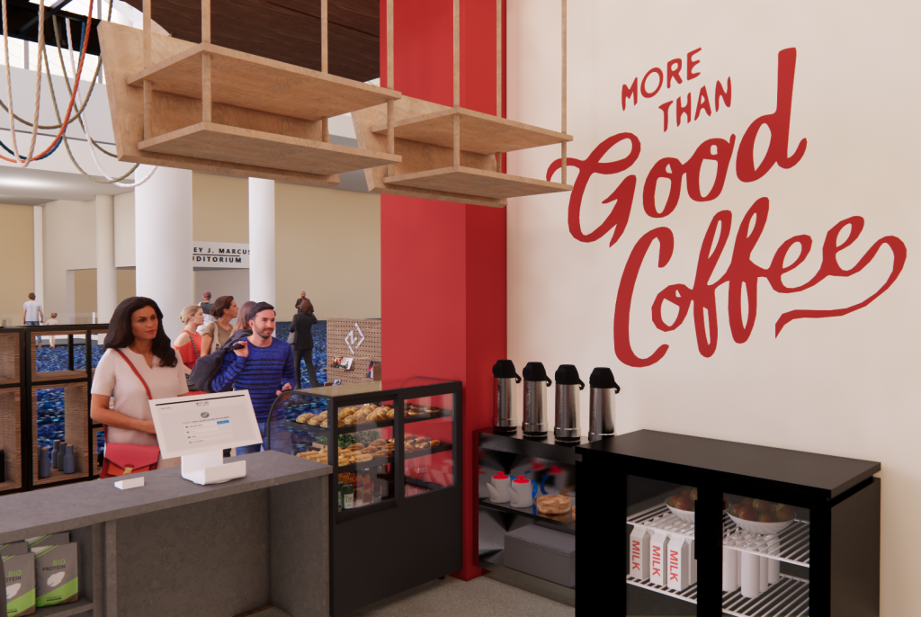
TheRed Box Identifies the space as a first touch point as the kiosk is right of the entrances. The color entices you to investigate what the shop is selling/providing.
The reflected pattern in the ceiling and floor helps convey the direction of traffic.
The final design brings together elements from a subtle and basic shape with dynamic angles and structures into a more doable striking design.
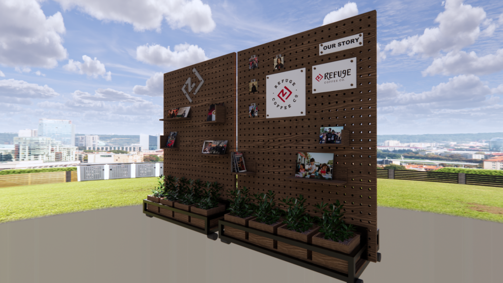
Parts of the whole
The design was about more than a beautiful facade. The goals are to create an adaptable display art that embodies both Refuge Coffee Co. and GWCCA. The two brands’ values and missions merged as one, as well as developing a space that can easily transform based on the convention’s needs and for the future use of the Kisok area.
Its whole is modular, so as the parts come together or spread out, the narrative is still defined. Using that ideology, the team designed flexible displays that could provide a surface to share the story behind Refuge, which is about being a place to help immigrants create workplace skills and helps them acclimate to the new customs within the United States.
The pieces go together in a way that the lines and path used create a larger story that embraces circulation, queuing a visual divided between the coffee and the mingling visitors on any given day.